

How to Sell More: Avoidable Website Mistakes
Your website is a 24/7 sales engine. Every single second, it's either generating leads and building credibility, or it's confusing your visitors and sending them straight to your competitors.
The hard truth? The average website conversion rate across all industries sits right around 3% to 4%. That means for every 100 people who land on your site, 96 of them leave without doing a single thing. No phone call, no form fill, just gone.
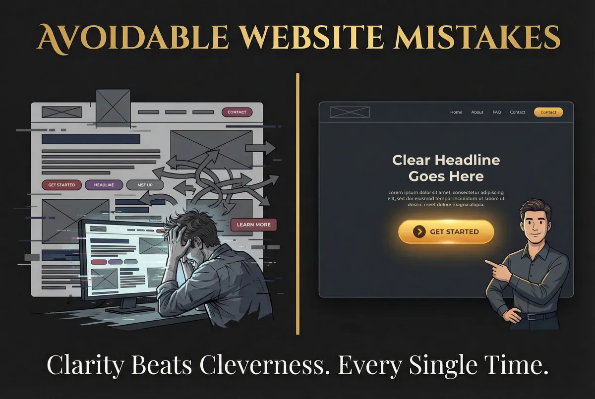
Most business owners assume they need a massive, expensive redesign. They think it's a design problem. But it's almost always a structural problem—a clarity problem. And it's costing you revenue every single day.
The Silent Killer of Sales
We are all terrified of making the wrong move with our marketing. The fear of making a mistake is exactly why so many websites stay stagnant. It's also why conversion rate optimization (CRO) agencies charge $15,000 to $30,000 a month to come in and fix these exact issues.
But if you know exactly whatnotto do, moving forward becomes incredibly simple. When you strip away the common errors, the confusing copy, the hidden signals, and the weak calls to action, you are left with a clear path to revenue.
Let's look at a few of the most common, avoidable mistakes that are quietly sabotaging your sales.
Mistake 1: Using Insider Language

Your customers don't speak your company jargon. They don't care about your acronyms or your technical terms. They care about themselves and their problems.
When you use industry jargon, you create a barrier. You might think you sound smart, but you're really just confusing people. And as Donald Miller says, "If you confuse, you lose."
The Fix:Translate everything. Speak the language of your customer's problems. Talk about the solutions they are actively searching for. Instead of saying "leverage synergistic solutions," just say "get more customers." It's direct, clear, and easy to understand.
Mistake 2: Too Much on the Page
If your header or hero section is cluttered with too many words, you're burying the value proposition.
Visitors are not reading your website in detail. At best, they are skimming or scanning. You have five seconds or less to grab their attention and communicate your value. If they can't grasp what you do quickly, they make up their mind and they're gone.
The Fix:One clear message is always more powerful than five competing ones. Keep your main headline tight. Cut the fluff. Make it easy for someone to scan your site and instantly know how you can help them.
Mistake 3: Weak Call to Action Language

Generic CTAs like "Click Here" or "Learn More" are conversion killers. They don't tell the visitor anything about the benefit they'll receive. "Learning" sounds like work. "Clicking" sounds like work.
The Fix:Use active, benefit-driven language. Studies show that benefit-driven CTAs perform significantly better. Instead of "Click Here," use "Get Your Free Guide," "Start My Free Trial," or "Book My Strategy Call." Tell them exactly what they get by taking action.
Stop Bleeding Revenue Today
This is not about redesigning your entire site. It's about making small, strategic tweaks that deliver real results on the bottom line. It's about achieving clarity.
Clarity beats cleverness every single time. When your message is clear, people understand it. They engage. But when it's confusing, they leave. And that confusion is costing you conversions, leads, and revenue.
Ready to dive deeper into the exact structural fixes that turn a confusing website into a lead-generating machine? We cover the full framework, including how to structure your CTAs, why clever taglines fail, and the critical importance of lead magnets in our full masterclass.
Join the community and get access to the full training:Join Sell More Academy

Facebook
Instagram
LinkedIn
X
Youtube
TikTok
Pinterest